
What is data visualization?
Human minds
are more flexible and adaptable to the graphic illustration of data than to
textual data. We can comprehend things when they are visualized. It is better
to depict the information through a graph in which we can analyze the data more
efficiently and make a specific decision on the basis of data analysis. Before
learning the matplotlib, we need to understand data visualization and why data
visualization is essential. Graphics provides an excellent approach to data
exploration that is necessary for the presentation of results. Data
visualization is a new term and expresses the idea that involves more than just
representing data in the graphical form (instead of using the textual form). It
is most frequently used to translate complex information into digestible
insights for non-technical audiences.
Why need data visualization?
- It identifies areas that need improvement and attention.
- It clarifies the factors.
- It helps to understand which product to place where.
- Predict sales volumes.
What is Matplotlib?
It is a Python library that is defined as a multi-platform data visualization library built on a Numpy array. It can be used in python scripts, shell, web application, and another graphical user interface toolkit. There are thousands of libraries in Python, and Matplotlib is one of the most powerful tools for data visualization in Python. Matplotlib tries to make easy things easy and hard things possible. You can generate plots, histograms, power spectra, bar charts, error charts, scatterplots, etc., with just a few lines of code. This can be very helpful when discovering and getting to know a dataset and can help with classifying patterns, corrupt data, outliers, and much more. With a little domain knowledge, data visualizations can be used to express and demonstrate key relationships in plots and charts. The static does indeed focus on quantitative description and estimations of data. It provides an important set of tools for gaining a qualitative understanding. There are five key plots that are used for data visualization which we discuss in this article are as follows,
- Line Graph / Plot
- Bar Graph / Plot
- Histogram Graph / Plot
- Scatter Graph / Plot
- Pie Graph / Plot
Install Matplotlib using with Anaconda Prompt
Matplotlib can be installed using the Anaconda Prompt by typing the following command.
conda install matplotlib
Install Matplotlib with pip
Matplotlib can be installed using the python command prompt by typing the following command.
pip install matplotlib
Importing the library
To get matplotlib up and running in our environment, we need to import it.
import matplotlib.pyplot as plt
Whenever you plot with matplotlib, the two main code lines should be,
1) Type of graph — this is where you define a bar chart, line chart, etc.
2) Show the graph — this is to display the graph
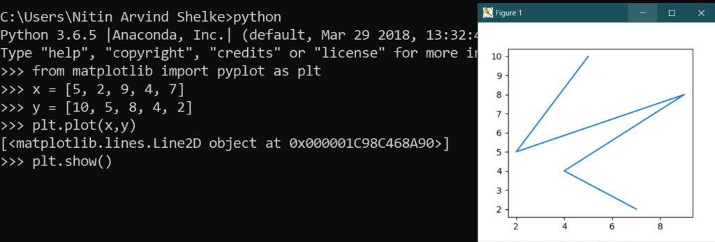
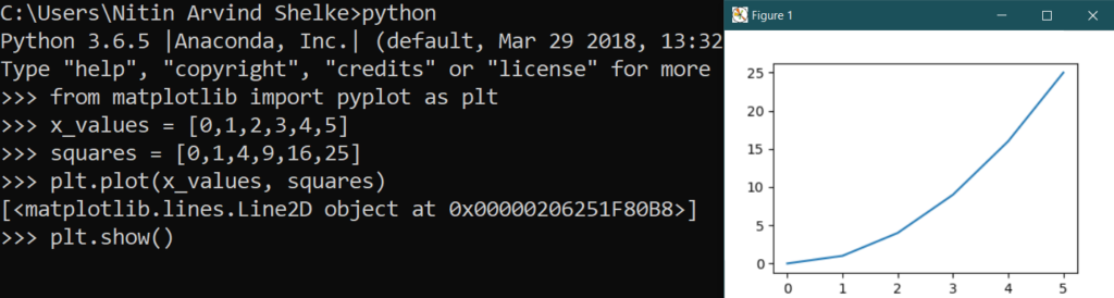
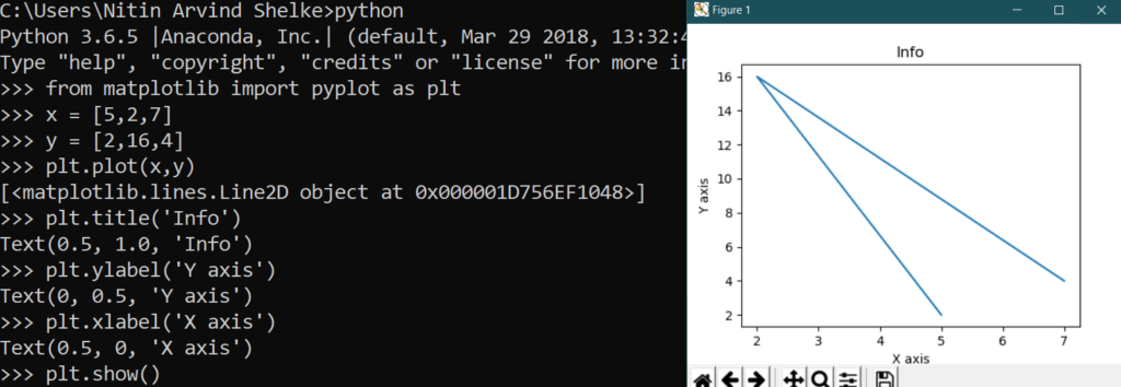
Line Plot: The line graph is one of charts which shows information as a series of the line. The graph is plotted by the plot() function.
# Example 1.1: Line plot:
# importing matplotlib module
from matplotlib import pyplot as plt
# x-axis values
x = [5, 2, 9, 4, 7]
# Y-axis values
y = [10, 5, 8, 4, 2]
# Function to plot
plt.plot(x,y)
# function to show the plot
plt.show()
# Example 1.2: Line plot:
#create data for plotting
from matplotlib import pyplot as plt
x_values = [0,1,2,3,4,5]
squares = [0,1,4,9,16,25]
#the default graph style for plot is a line
plt.plot(x_values, squares)
#display the graph
plt.show()
# Example 1.3: Line plot:
from matplotlib import pyplot as plt
x = [5,2,7]
y = [2,16,4]
plt.plot(x,y)
plt.title(‘Info’)
plt.ylabel(‘Y axis’)
plt.xlabel(‘X axis’)
plt.show()
Bar Plot: Bar graphs are one of the most common types of graphs and are used to show data associated with the categorical variables. Matplotlib provides a bar() to make bar graphs which accepts arguments such as: categorical variables, their value and color.
# Example 2.1: Bar plot:
# importing matplotlib module
from matplotlib import pyplot as plt
# x-axis values
x = [5, 2, 9, 4, 7]
# Y-axis values
y = [10, 5, 8, 4, 2]
# Function to plot the bar
plt.bar(x,y)
# function to show the plot
plt.show()

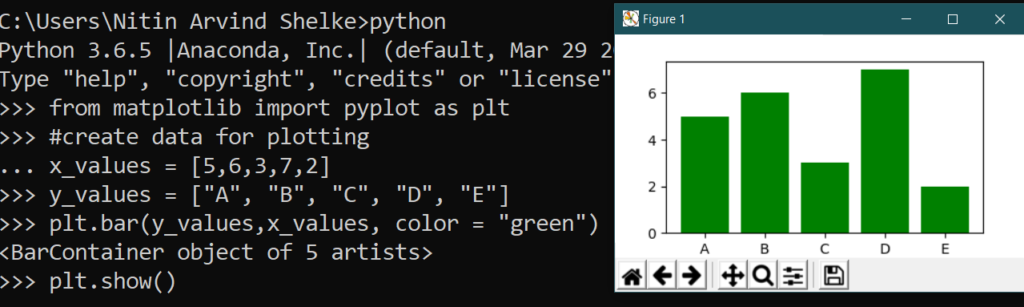
# Example 2.2: Bar graphs
from matplotlib import pyplot as plt
#create data for plotting
x_values = [5,6,3,7,2]
y_values = [“A”, “B”, “C”, “D”, “E”]
plt.bar(y_values,x_values, color = “green”)
plt.show()
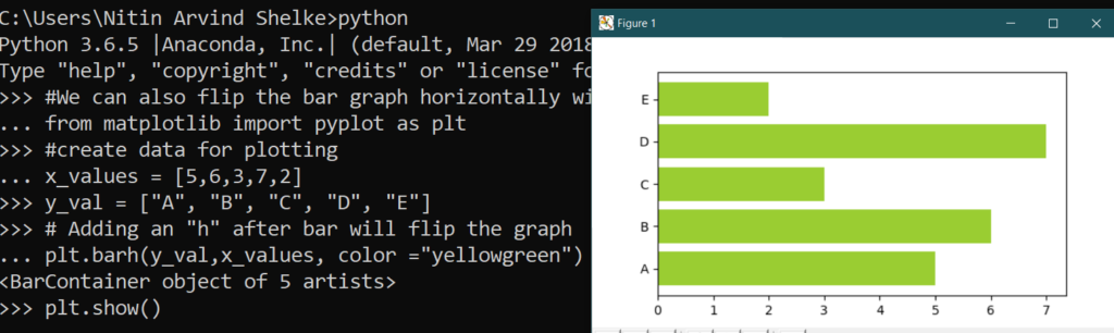
# Example 2.3: Bar graph
#We can also flip the bar graph horizontally with the following,
from matplotlib import pyplot as plt
#create data for plotting
x_values = [5,6,3,7,2]
y_val = [“A”, “B”, “C”, “D”, “E”]
# Adding an “h” after bar will flip the graph
plt.barh(y_val,x_values, color =”yellowgreen”)
plt.show()
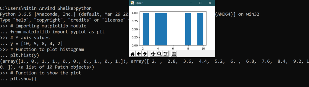
Histogram Plot: A histogram is a type of bar plot that shows the frequency of a number of values compared to a set of values ranges.
# Example 3.1: Histogram:
# importing matplotlib module
from matplotlib import pyplot as plt
# Y-axis values
y = [10, 5, 8, 4, 2]
# Function to plot histogram
plt.hist(y)
# Function to show the plot
plt.show()
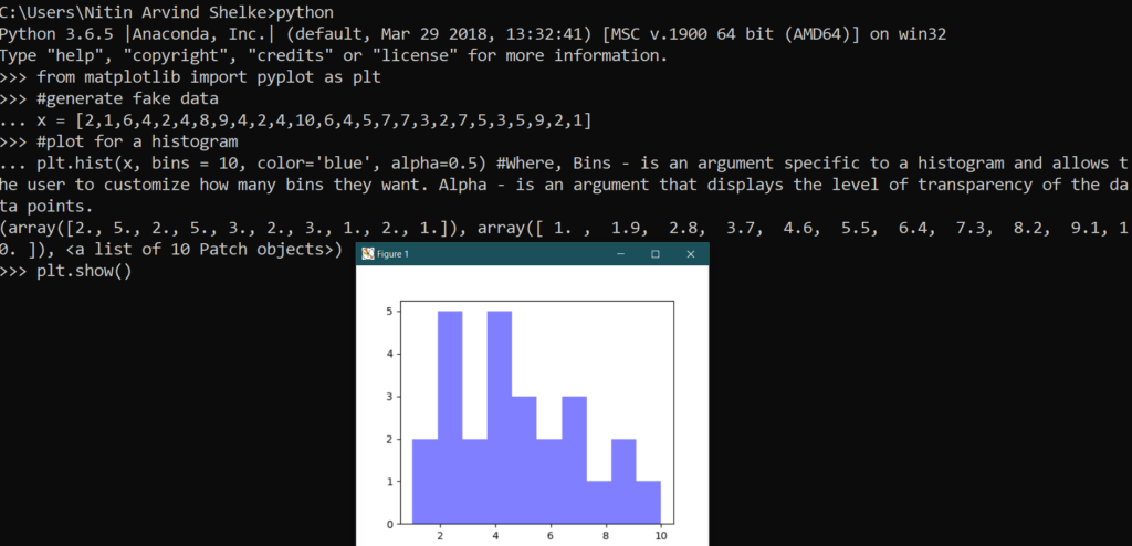
# Example 3.2: Histograms
from matplotlib import pyplot as plt
#generate fake data
x = [2,1,6,4,2,4,8,9,4,2,4,10,6,4,5,7,7,3,2,7,5,3,5,9,2,1]
#plot for a histogram
plt.hist(x, bins = 10, color=’blue’, alpha=0.5) #Where, Bins — is an argument specific to a histogram and allows the user to customize how many bins they want. Alpha — is an argument that displays the level of transparency of the data points.
plt.show()
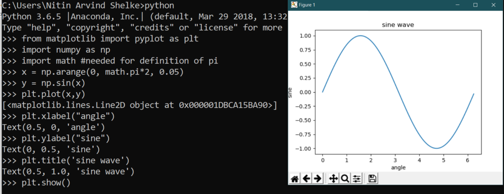
# Example 3.3: Histograms
from matplotlib import pyplot as plt
import numpy as np
import math #needed for definition of pi
x = np.arange(0, math.pi*2, 0.05)
y = np.sin(x)
plt.plot(x,y)
plt.xlabel(“angle”)
plt.ylabel(“sine”)
plt.title(‘sine wave’)
plt.show()
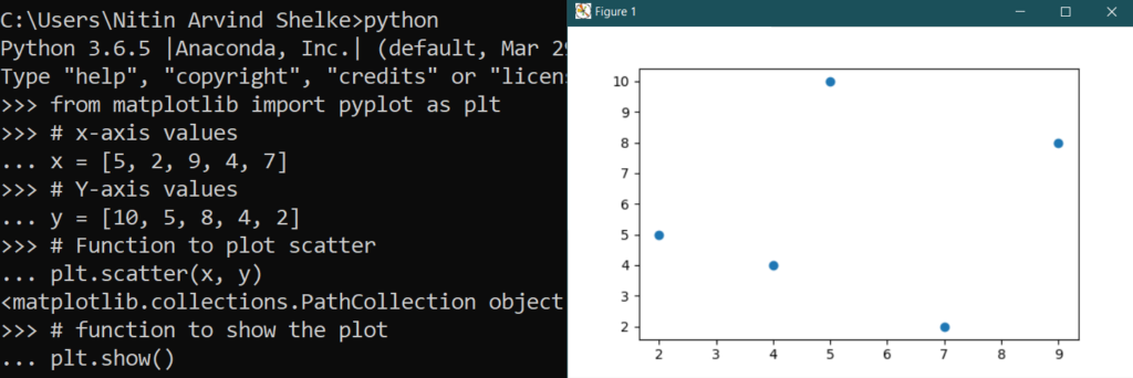
Scatter Plot: The scatter plots are mostly used for comparing variables when we need to define how much one variable is affected by another variable. The data is displayed as a collection of points. Each point has the value of one variable, which defines the position on the horizontal axes, and the value of other variable represents the position on the vertical axis.
# Example 4.1: Scatter Plot:
# importing matplotlib module
from matplotlib import pyplot as plt
# x-axis values
x = [5, 2, 9, 4, 7]
# Y-axis values
y = [10, 5, 8, 4, 2]
# Function to plot scatter
plt.scatter(x, y)
# function to show the plot
plt.show()
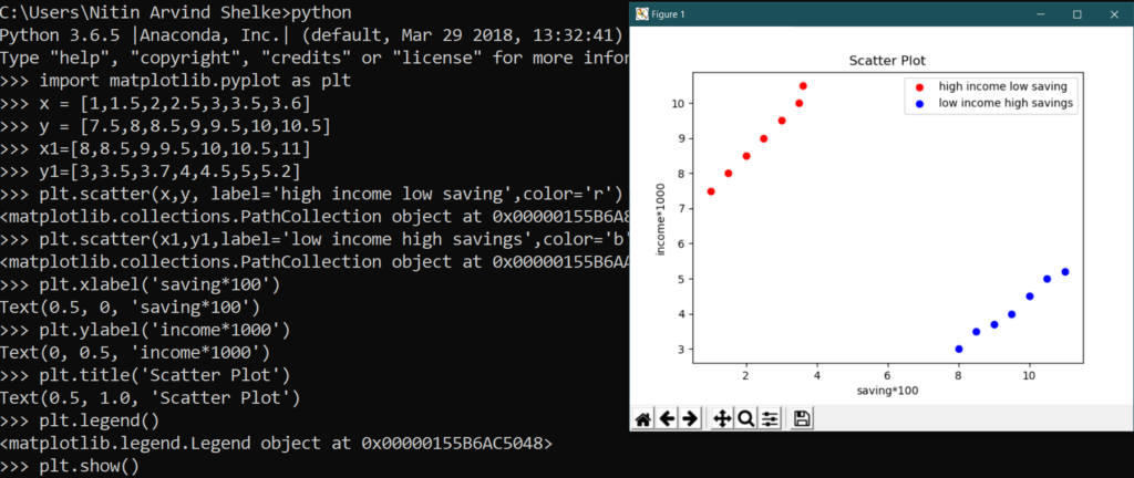
# Example 4.2: Scatter Plot :
import matplotlib.pyplot as plt
x = [1,1.5,2,2.5,3,3.5,3.6]
y = [7.5,8,8.5,9,9.5,10,10.5]
x1=[8,8.5,9,9.5,10,10.5,11]
y1=[3,3.5,3.7,4,4.5,5,5.2]
plt.scatter(x,y, label=’high income low saving’,color=’r’)
plt.scatter(x1,y1,label=’low income high savings’,color=’b’)
plt.xlabel(‘saving*100’)
plt.ylabel(‘income*1000’)
plt.title(‘Scatter Plot’)
plt.legend()
plt.show()
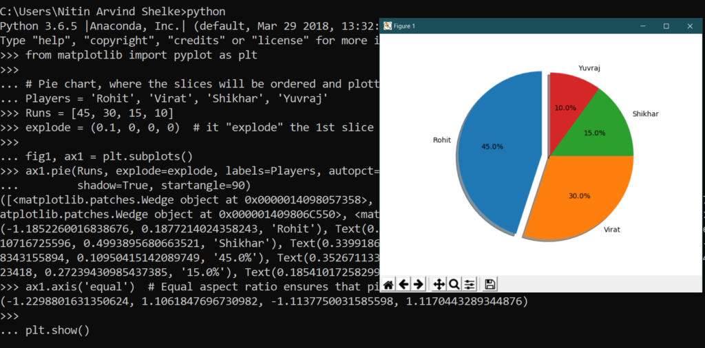
Pie Plot: A pie chart is a circular graph that is broken down in the segment or slices of pie. It is generally used to represent the percentage or proportional data where each slice of pie represents a particular category. Let’s have a look at the below example:
# Example 5.1: Pie Plot:
from matplotlib import pyplot as plt
# Pie chart, where the slices will be ordered and plotted counter-clockwise:
Players = ‘Rohit’, ‘Virat’, ‘Shikhar’, ‘Yuvraj’
Runs = [45, 30, 15, 10]
explode = (0.1, 0, 0, 0) # it “explode” the 1st slice
fig1, ax1 = plt.subplots()
ax1.pie(Runs, explode=explode, labels=Players, autopct=’%1.1f%%’,
shadow=True, startangle=90)
ax1.axis(‘equal’) # Equal aspect ratio ensures that pie is drawn as a circle.
plt.show()