
The human minds are more versatile and adaptable to visual graphics than to textual information. Data visualization is a technique that expresses, analyzes, and represents the massive amount of data in the form of a graph, chart, or animations instead of using the textual representation. Data visualization translates complex information into digestible insights for non-technical audiences. There are many libraries in Python for data visualization, but seaborn is one of the most powerful tools for data visualization in Python. Seaborn is a Python library that is defined as a multi-platform data visualization library built on top of Matplotlib. The Seaborn library is used to handle the challenging data visualization task, and it’s based on the Matplotlib library. Among all the libraries, Seaborn is a dominant data visualization library. With the help of Seaborn Library, you can generate line plots, scatter plot, bar plot, box plot, count plot, relational plot, and many more plots with just a few lines of code. It is one of the useful libraries in Data Science and machine learning related projects for better visualization of the data. Seaborn allows the creation of statistical graphics and has the following functionalities:
- API that is based on datasets allowing assessment between multiple variables
- It supports the multi-plot grids which are used for building complex visualizations
- Univariate and bivariate visualization available to compare between subsets of data
- It estimates and plots linear regression automatically
Python Seaborn vs. Matplotlib:
The difference between the Seaborn and Matplotlib are given below
| Matplotlib | Seaborn |
| It can be personalized, but it is challenging to figure out what settings are required to make plots more attractive. | On the other hand, Seaborn comes with numerous customized themes and high-level interfaces to solve this issue. |
| Matplotlib is mainly design for basic plotting only. | It provides a variety and complex type of visualiza-tion patterns so Seaborn is better than Matplotlib |
| It is a graphics library for data visualization with Python. It is integrated with NumPy and Pandas libraries. | It is integrated to work with Pandas data frames. It extends the Matplotlib library for creating beautiful graphics using a more straightforward set of methods. |
| Matplotlib works with data frames and arrays. It has different stateful APIs for plotting. | It works with the dataset as a whole and is much more intuitive than Matplotlib. For Seaborn, replot() is the entry API with ‘kind’ parameter to specify the type of plot, which could be line, bar, or any of the other types. Seaborn is not stateful. Hence, plot() would require passing the object. |
Installation of Seaborn Library:
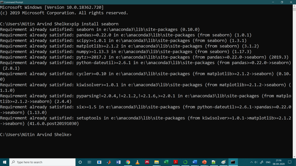
The seaborn library can be downloaded through a command prompt. If you are using pip installer for Python libraries, you can run the following line of command to download the library:
>> pip install seaborn
>>C:\Users\Nitin Arvind Shelke>pip install seaborn
Well, if you are using the Anaconda distribution of Python, you can use run the following command to download the seaborn library:
>> conda install seaborn
Importing the Seaborn Library:
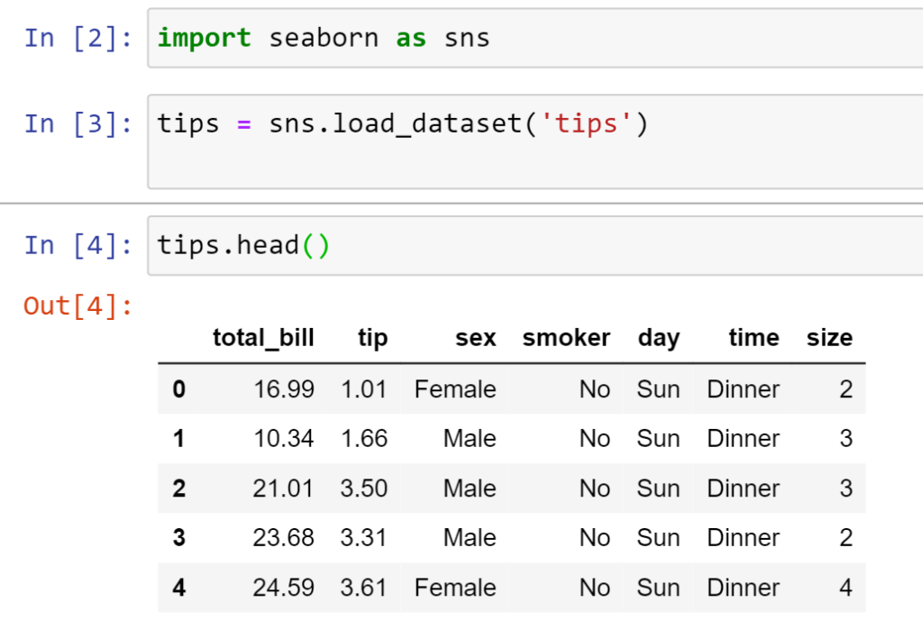
>>> import seaborn as sns
Visualization for Tip Dataset with Seaborn Library
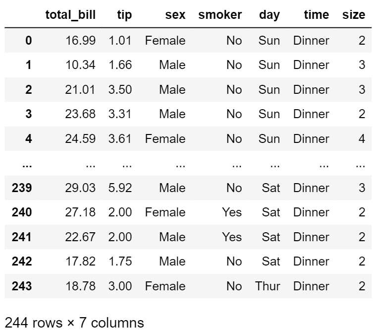
The dataset that we will use to draw our plots is the Tip Dataset, which is an inbuilt dataset that comes with the Seaborn library. Our task is to visualize the dataset with the help of different types of plots available in the seaborn library. The tip dataset that we are using is shown below
For that, we need to use the load_dataset function and pass it the name of the dataset.
# Importing the library
>>import seaborn as sns
# Loading the dataset
>>tips = sns.load_dataset(‘tips’)
>> tips.head() # gives us the first five rows of the dataset
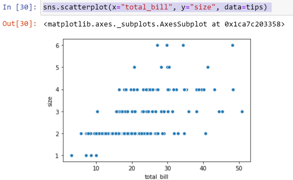
- Scatter Plot:
A scatter plot uses dots for representing the values for two different numeric variables. While the location of each dot on the horizontal and vertical axis indicates values for an individual data point
It primarily uses to observe and show relationships between two numeric variables. The dots in a scatter plot report not only the particular values of individual data points but also certain patterns when the data are taken as a whole. Let us plot a scatter-plot between the total_bill and size by using following line of code.
>>sns.scatterplot(x=”total_bill”, y=”size”, data=tips)
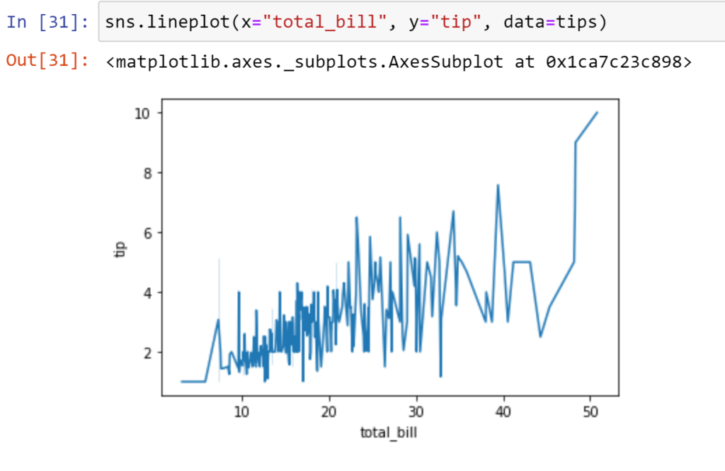
- Line Plot:
Line Plot are used to display quantitative values over a continuous interval or period. It is most frequently used to show trends and analyze how the data has changed over time. It is noted that the count of data records of the line graph is greater than two, which can be used for trend comparison of large data volume. We will plot a line plot between the size and tips. The following line of code is used to get the Line Plot
>> sns.lineplot(x=”total_bill”, y=”tip”, data=tips)
- Bar Plot:
It is one of the widely used plots for doing the data analysis and identifying certain trends in the dataset. Bars Charts are distinguished from Histograms, as they do not display continuous developments over an interval. The bar plot is used here to visualize which days brought in the highest tip from the customers. Let us plot the bar plot between day and tip column by using the following line of code
>> sns.barplot(x=”day”, y=”tip”, data = tips)
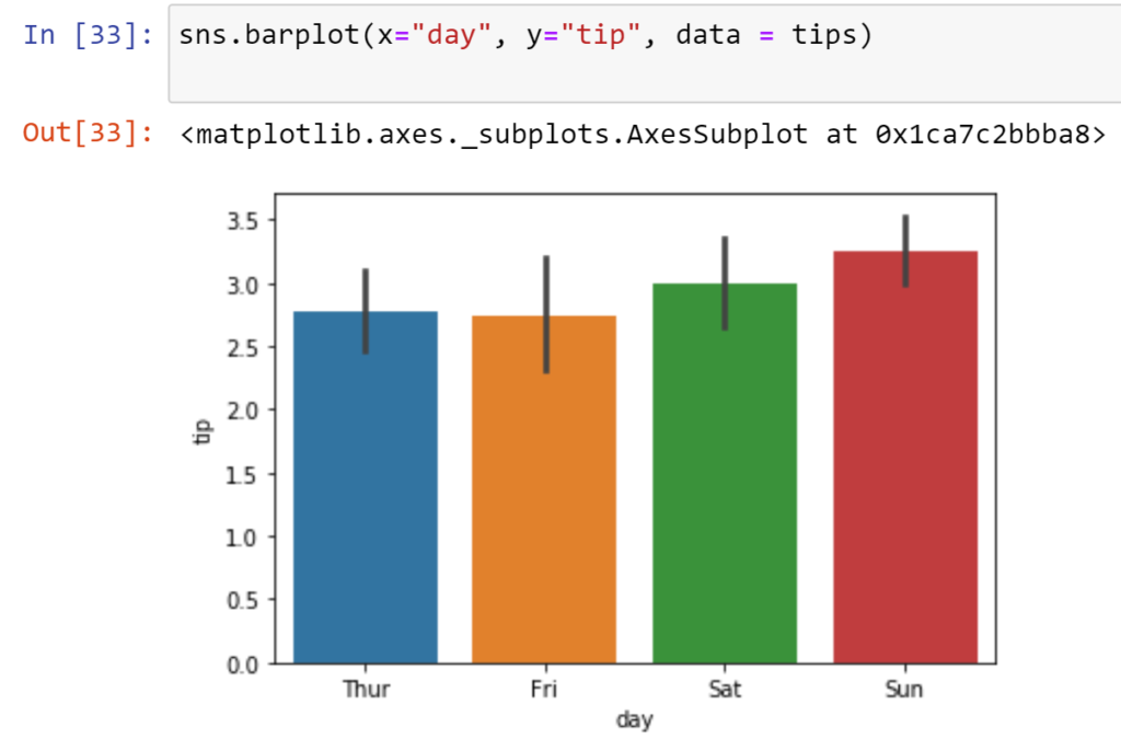
It is clear from the bar plot that the highest tip was received on Sunday.
- Box Plot:
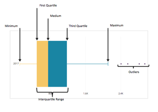
It is the visual representation of the statistical five-number summary of a given data set. Each box plot displays the minimum, first quartile, median, third quartile, and maximum values. Besides, you can choose to display the mean and standard deviation as dashed lines. Outliers appear as points in the visualization. A Five Number Summary includes:
- Minimum
- First Quartile
- Median (Second Quartile)
- Third Quartile
- Maximum
Let us plot boxplot between size and tip column by using the following line of code
>> sns.boxplot(x=”size”, y=”tip”, data = tips)
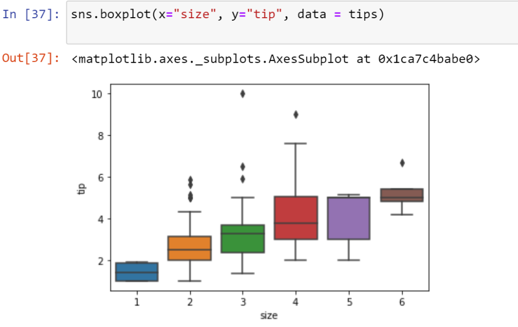
In the above graph, every box represents a size group. Whereas the median value of the tip column is represented by the horizontal line within the box.
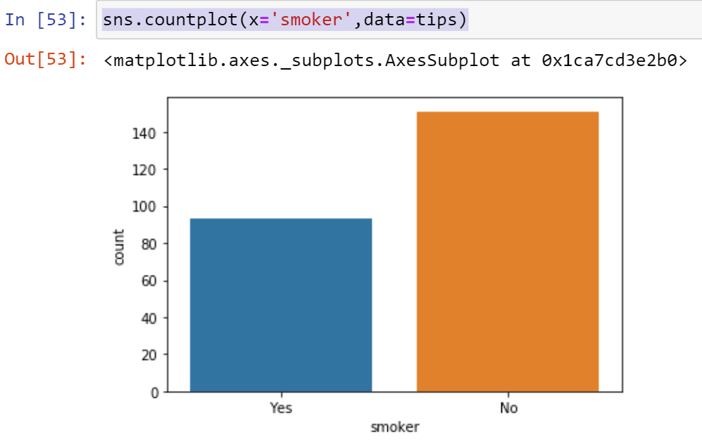
- Count Plot:
Count plot is used to plot a feature against the number of observations or occurrences. We will visualize the number of smokers and non-smokers in the dataset.>>sns.countplot(x=’smoker’,data=tips)
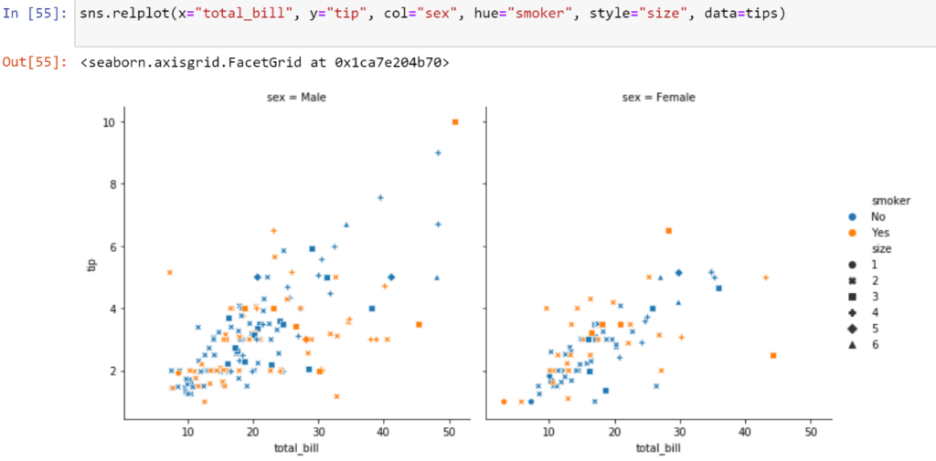
- Relational Plot:
The relational plot provides access to several different axes-level functions that show the relationship between any two variables with semantic mappings of subsets. Let us plot the relational plot between the tip and the total bill for each gender, smoker, and size..
>>sns.relplot(x=”total_bill”, y=”tip”, col=”sex”, hue=”smoker”, style=”size”, data=tips)
where col: The feature to be visualized in subplots column.
hue: The feature to be represented or distinguished in different colors.
style: The feature to be represented or distinguished with different styles.
size: The feature to be represented or distinguished with different sizes of markers.
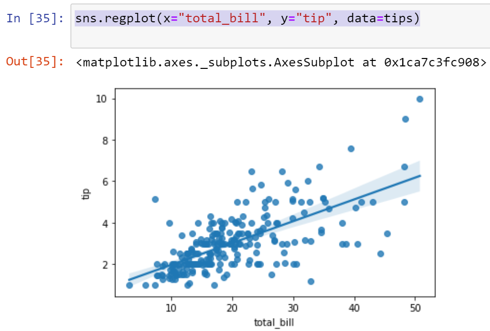
- Regression Plot:
The regression plot is one of the critical plots available in seaborn. It plots the data points and also draws a regression line. Let’s plot the regression plot between total_bill and tips by using the following line of code
>>sns.regplot(x=”total_bill”, y=”tip”, data=tips)