

How to Design the perfect eCommerce website with examples: With thousands of ecommerce website already present in the market, and new ones cropping every day, it is hard to attract people. To do that, you need quality and unique product, but how to make the customer stay on your website long enough to encourage them to buy the products? The answer is by making a unique, appealing, easy to use website.
You need to blow away your audience with the presentation of your products if you want the audience to buy these products.
E-commerce business will take over the world slowly, and if you want your business to stand apart, a gorgeous website is important. An amazing site will appeal to more people and will increase the sale of the product as well.
When it comes to designing a website, a lot of business owners get intimidated. But they don’t have to, even without designers; you can create your website using a lot of tools like WordPress and Canva. But I would suggest hiring a good designer as they have numerous ideas to make your website look good and actionable. Also, if you want some good and easy ideas, check the list below. Below we have decoded some websites who have a beautiful design that you can take inspiration from.
Let’s begin:
Big shots of your products and bold colors
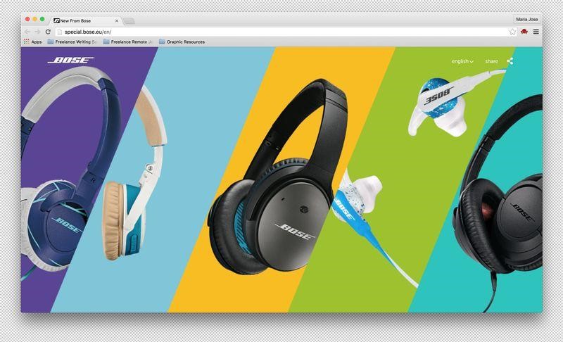
You must give a central stage to your products. You need to make them the highlight of the page so that people can see what they are being offered clearly. You can do this, especially for the new products that your company is offering, as the website New From Bose does.
The site has a horizontal layout, and it shows five of the newest products of the company. Also, their background is bold and they use selected images to attract people.
” Join our Digital Marketing Training and Increase your Business “
Use the grid for numerous options
If you want to showcase a lot of your products than the grid style can help you. Take inspiration from Chris Niedenthal who uses a grid system to display lots of his work. It not only helps him show a lot of his work but also provides the website with structure and scalability.

Don’t clutter your website
Sometimes using fewer elements appeals to more people. Less is more, and when you present your products using clear typography and muted colors, as ETQ Amsterdam does, then you attract more people. Their subtle animation and large imagery, along with subtle colors and font make their website unique.
Experiment with function and form to make something different
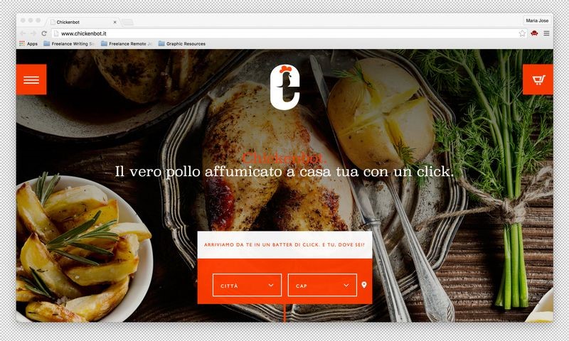
You don’t have to design your website with the usual drop-down or side menu. You can spice it up using different forms and functions. As the website chickenbot does, the Italian chicken delivery site uses a hamburger menu which expands into a beautiful orange list with lots of options.
Minimize navigation for ease of use
A consumer loves a site that has less navigation and doesn’t send them from one page to another to place their order. You can take a look at the website of My Deejo, which places all the options on one page. Using radio buttons and drop-down option, it lets customers personalize their product at a single place.
Make your product central
Making the product central is important, because only your product description, imagery, and angle will satisfy the person buying it. For example, JM & Sons who are a Canadian furniture maker, have made a separate page on their website for their products. It has loads of photos of the product from different angles to satisfy the user.
Don’t forget about white space
White space provides a clean and uncluttered look to your website. This blank space gives more emphasis to your products like Best Made Co. This apparel store’s website uses a lot of white space to showcase their vast inventory uncluttered.
Custom lettering to give your website a personalized look
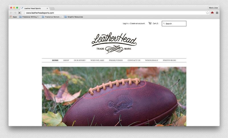
A custom lettering not only makes your website unique but gives it a personalized look too. If you want to see how custom lettering can make your website stand out, take a look at LeatherHeads Sports, who make leather sports products.
Color accents for highlighting crucial details
When you use color accents, it highlights crucial details about your website like calls-to-action. It also adds texture to your UI and adds visuals to your website that will attract more audiences like Longboard living.
Easy search option
A website that is user-friendly and easy to use for customers attracts more audience and increase sales. Take inspiration from LEIF whose website lets people search for anything they want using the search bar. You can do something like this so that people can navigate your site easily
Header for information
The header is a great way to inform people about the different products they can offer their customers. It helps the customer see all the varieties they have and go straight for the product they want. Just like Graze, which shows all their products on the header to inform people about their services?
Use Videos
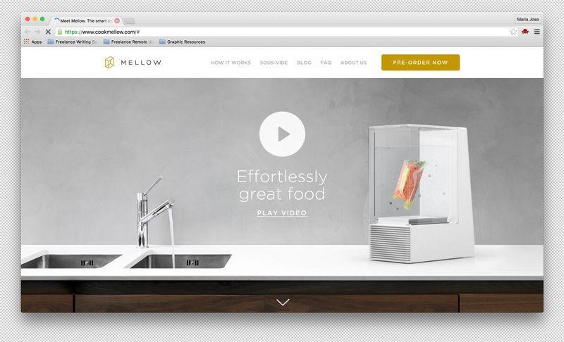
The video makes a powerful impact on people and shows people what you are selling and how it can change lives. Cook Mellow does exactly that by showing a beautiful video that informs people about their products and so on.
Use products to create patterns
Every website uses visuals, but if you want to do something, you can create patterns using your products as Aark Collective does. Just like them you can pair it with clean typography and color scheme, and engage people.
Social media integration
You want to increase conversion rates and promote your product while doing so. The best way to do that is to integrate social media with your website so that people can share what they are buying right away as Vanmoof does.
Extra-large photos
Use big shots of your products to engage the audience and give your product more footage just like Warby and Parker does. It looks regal, different and beautiful even on mobile.
Which design inspired you the most? Hit me in the comments below.